
713 ord(words. Scroll down for English version) 2014 03 02. Under redigering.
![]() Efter att ha gått igenom, lagt ut och översatt mina tankar om trender och tidstypiskt till engelska, vilket jag gjort först 2014, så har jag lagt märke till några kommentarer om design trender, gissningar och några exempel.
Efter att ha gått igenom, lagt ut och översatt mina tankar om trender och tidstypiskt till engelska, vilket jag gjort först 2014, så har jag lagt märke till några kommentarer om design trender, gissningar och några exempel.
”En modern retrokänsla”, skriver Lotta Ahlvar, VD (CEO) på ”Swedish Design/Fashion Council”. Läs hennes kommentar i färgfirman Alcros nättidning. Två veckor innan rapporterar hon i samma nättidning (Alcros) från den franska inredningsmässan ”Maison et Objets” i Paris.
På spaning i Paris; Grått, grått, grått, med härliga inslag av korall
… De rosa och pastelliga kulörerna kommer att finnas med i inredningssammanhang en bra tid framöver. Rosa får samsas i olika toner av korallorange och ofta med grått som bas. Detta såg vi tydligt på den spännande franska inredningsmässan Maison et Objets i Paris.”

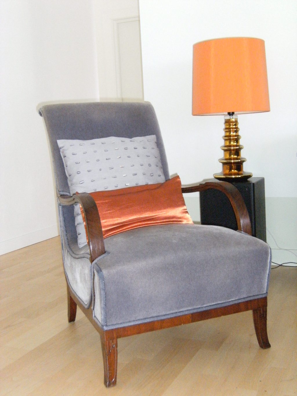
… och så här råkar en hörna i mitt hus se ut.
fortsättning följer…
 follow up 2014 of trend guess 2008
After having revived my thoughts about trends and characteristics of a period of time by translating and posting it, I have noticed some design notes, trend guesses and example of contemporary design.
”A modern feel in retrostyle”, writes Lotta Ahlvar, CEO at Swedish Design/Fashion Council. Read her comment in one of the Swedish color entreprises web magazines (Alcro.se) . It is written in Swedish but you can see the colorscheme.
Two weeks before in the same magazine she reports from ”Maison et Objets” in Paris:
Grey, grey, grey with lovely touches of coral.
… that pink and pastel colors in interior design are here to stay for quite some time. Pink together with tones of coral orange and often with grey as a base. This was obvious at the intriguing french fair of interior design ‘ Maison et Objets i Paris’.
And this is how a corner in my house ”happens” to look like.
In one of the Swedish talkshows the architect Olle Rex is invited to talk about his designideas of the studio they sit in. The decorator, Louise, once one of his students at ”konstfack” (University college of Arts, Crafts and Design) introduce him: ”He told us to consider how the exterior relates to the interior design, and what I do as a designer is to realize peoples dreams.” What Olle says in the talk show you can listen to in this link until 25 of March 2014.
I summon what I noticed and remembered he said:
He talks about the attitude to furniture. To use them, see them as parts of our life to be passed on through generations, as traces from generation to another. In the studio he has mixed modern shapes with classic. Crafts, handmade furniture – show traces of the hand who has made it. He advises to choose what you love.
In the studio where they sit he has chosen to furnish it with rounded and organic shapes. The dark color on the floor, gives a feel of safety and stability to stand on. Dark background in different tones and shades. Created by fabric with different textures, one of them is a rug, glittering and sparkling like stars. They bring depth and space to the room which is important from a ”filmic” point of view. Color tones to match and make the human skin tone stand out.
I could notice while watching the show that it was scarce with accessories and no diagonals, instead squares, rectangles and rounded asymmetric shapes, wood, leather and toned down colors. One of the shapes was striving upwards, it was not made of a red organic material which I suggested in my trend guess, but in cheeky metallic, the Italian lamp. The closest to diagonals was the wooden legs spreading out from the tables round surfaces. Dark colors, but not to hide in, and not as an expression of conformity (like bankers blue, military green or Nazi-brown) but to create depth of space, from which the human stand out. The dominating color tone in his example of how to furnish and dress was deep purple.
